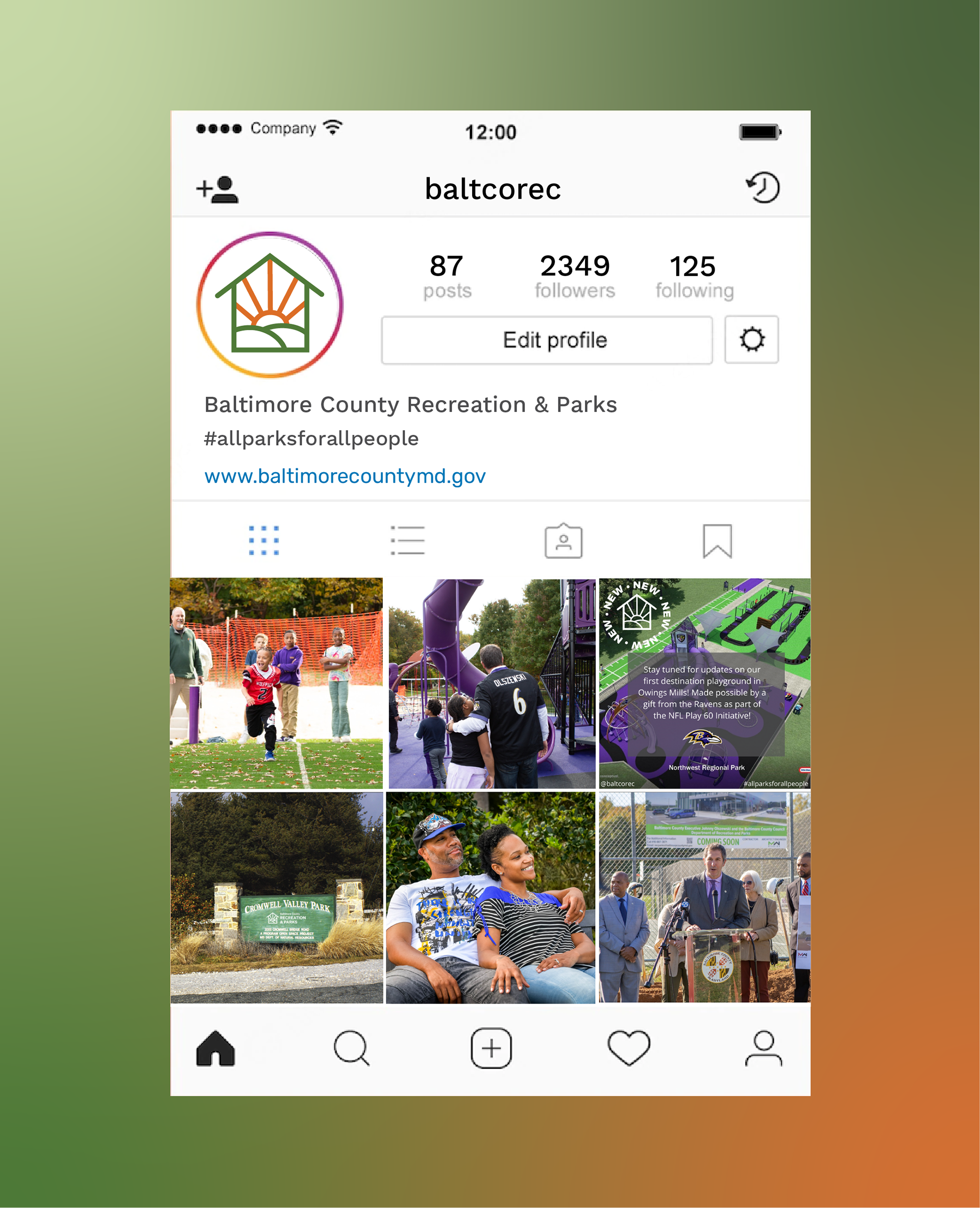
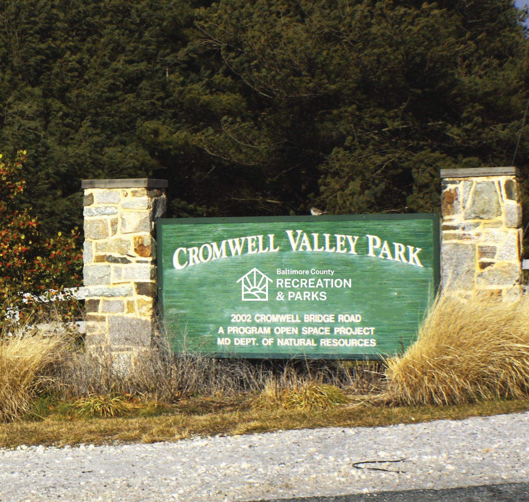
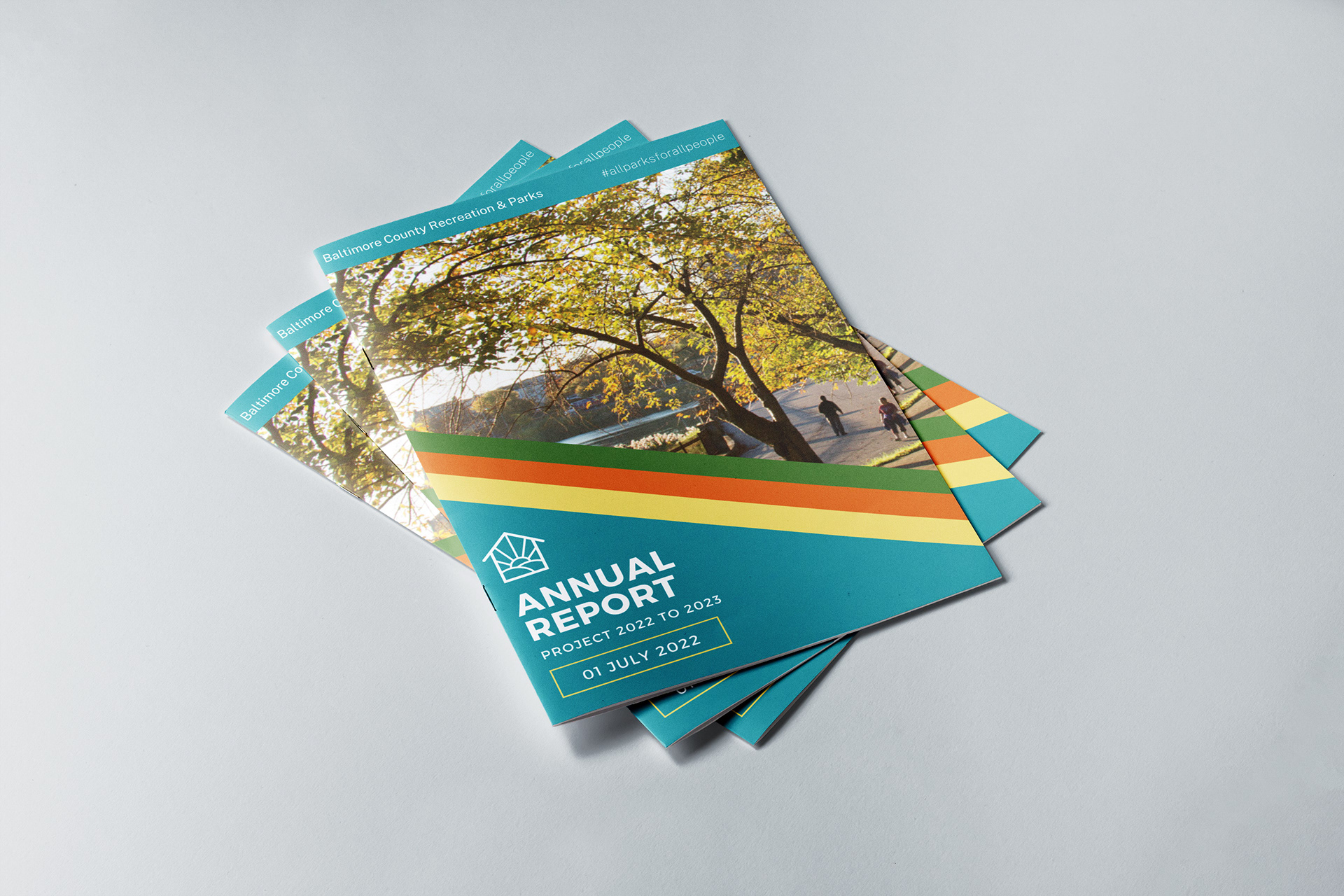
Brief: The goal of this project was to redesign the logo and brand identity for Baltimore County Department of Recreation & Parks and show its implementation in touch points. Through research on the client’s brand and audience, I was able to understand their community values and utilize them in my designs.
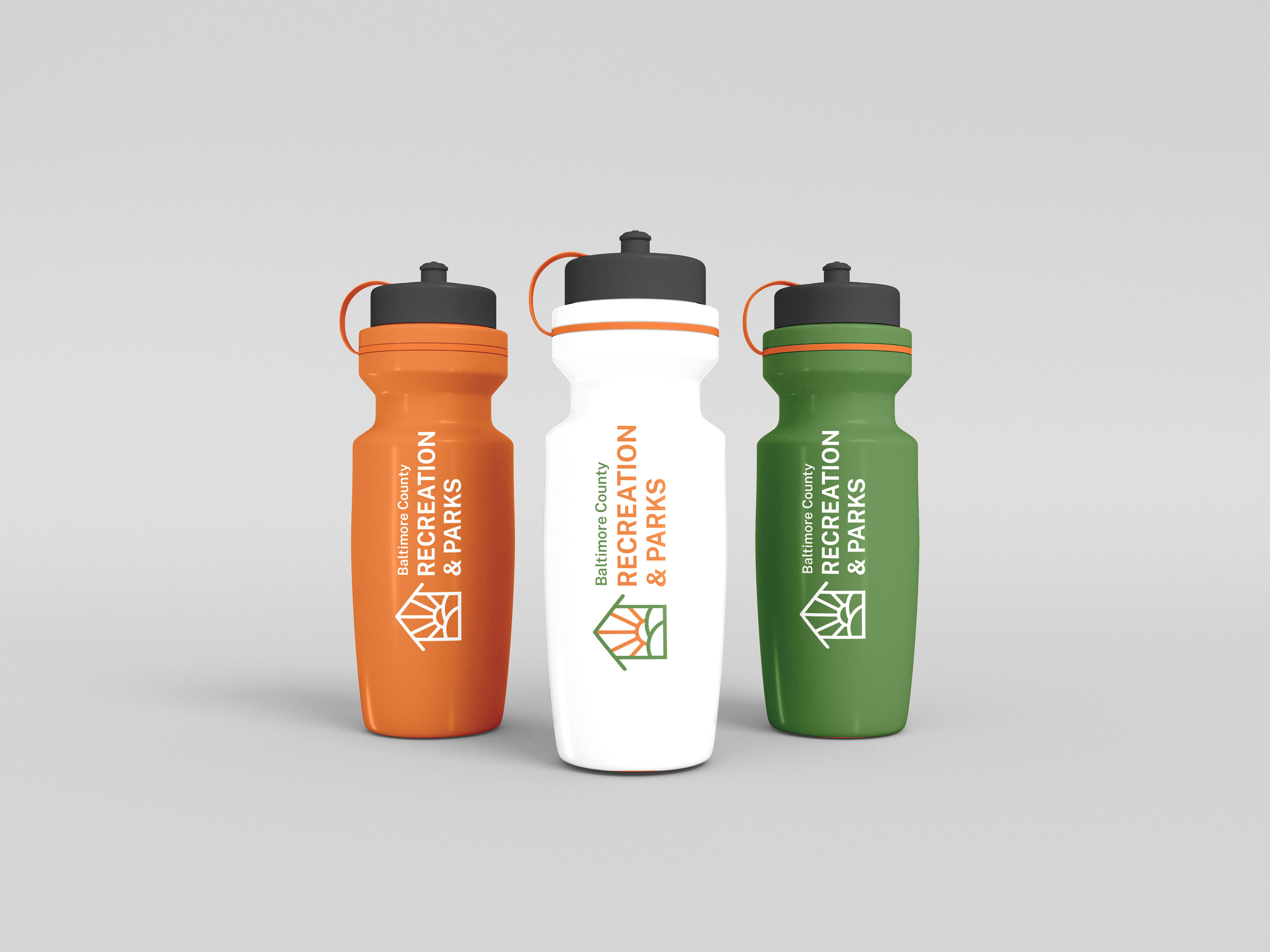
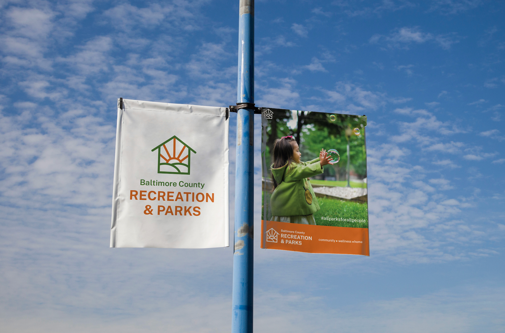
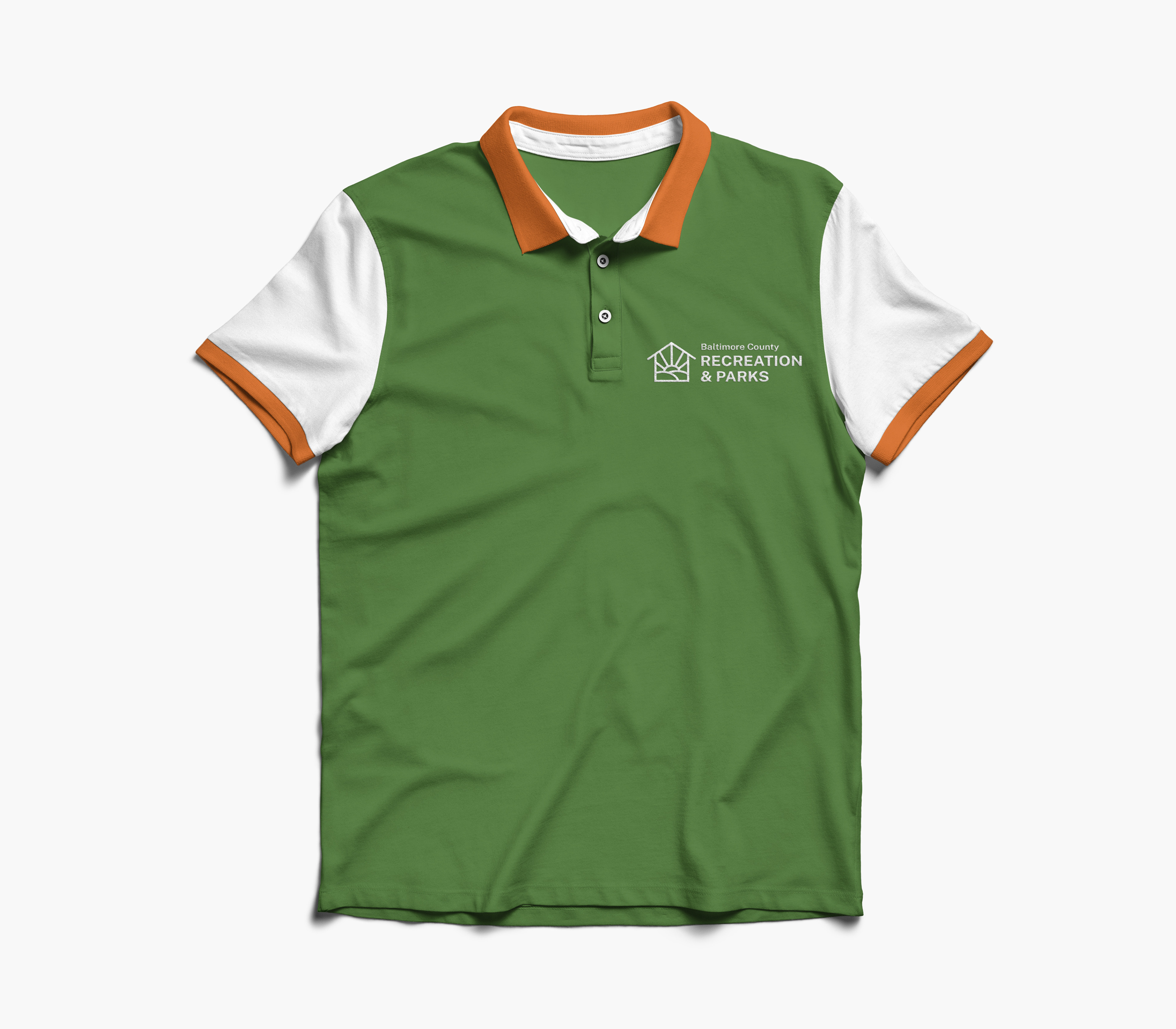
Deliverables: Logo Variations, Brand Guidelines, Social Media, Signage, Merchandise
Programs: Adobe Illustrator, Adobe Photoshop
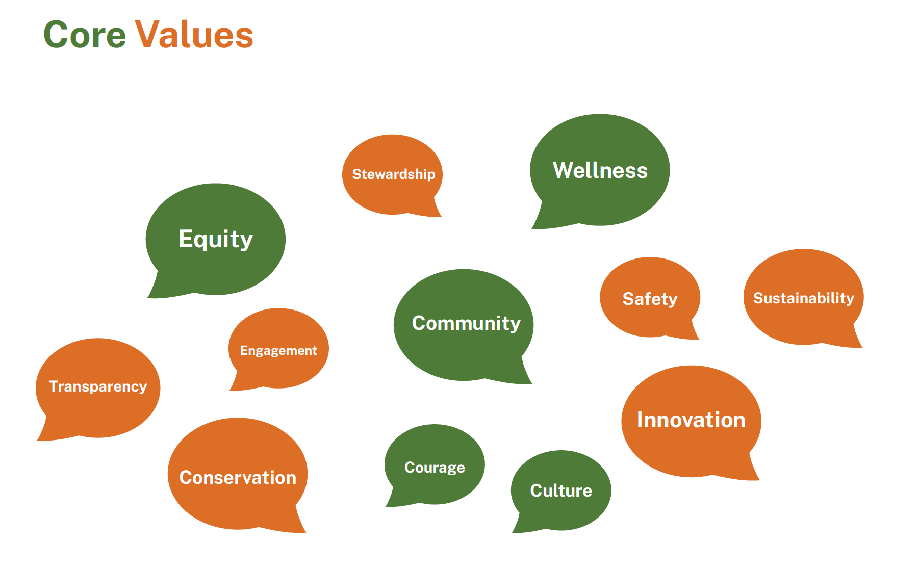
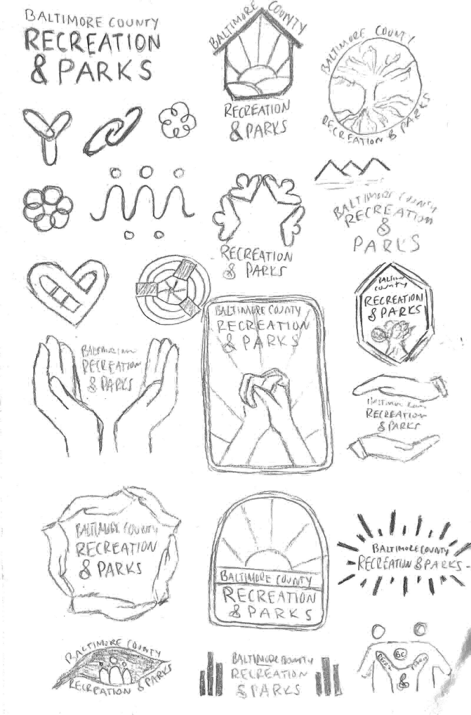
The creative process began by understanding the organization's brand mission and audience. Through client conversation and research within the community, I discovered that Baltimore Department of Recreation and Parks value topics like equity, culture, and community wellness and aim to emphasize their slogan and hashtag #allparksforallpeople. I began the ideation phase by hand-sketching logo ideas centered around their values and brand messaging. I took my concepts digital and created a primary horizontal logo utilizing typographic and visual components.
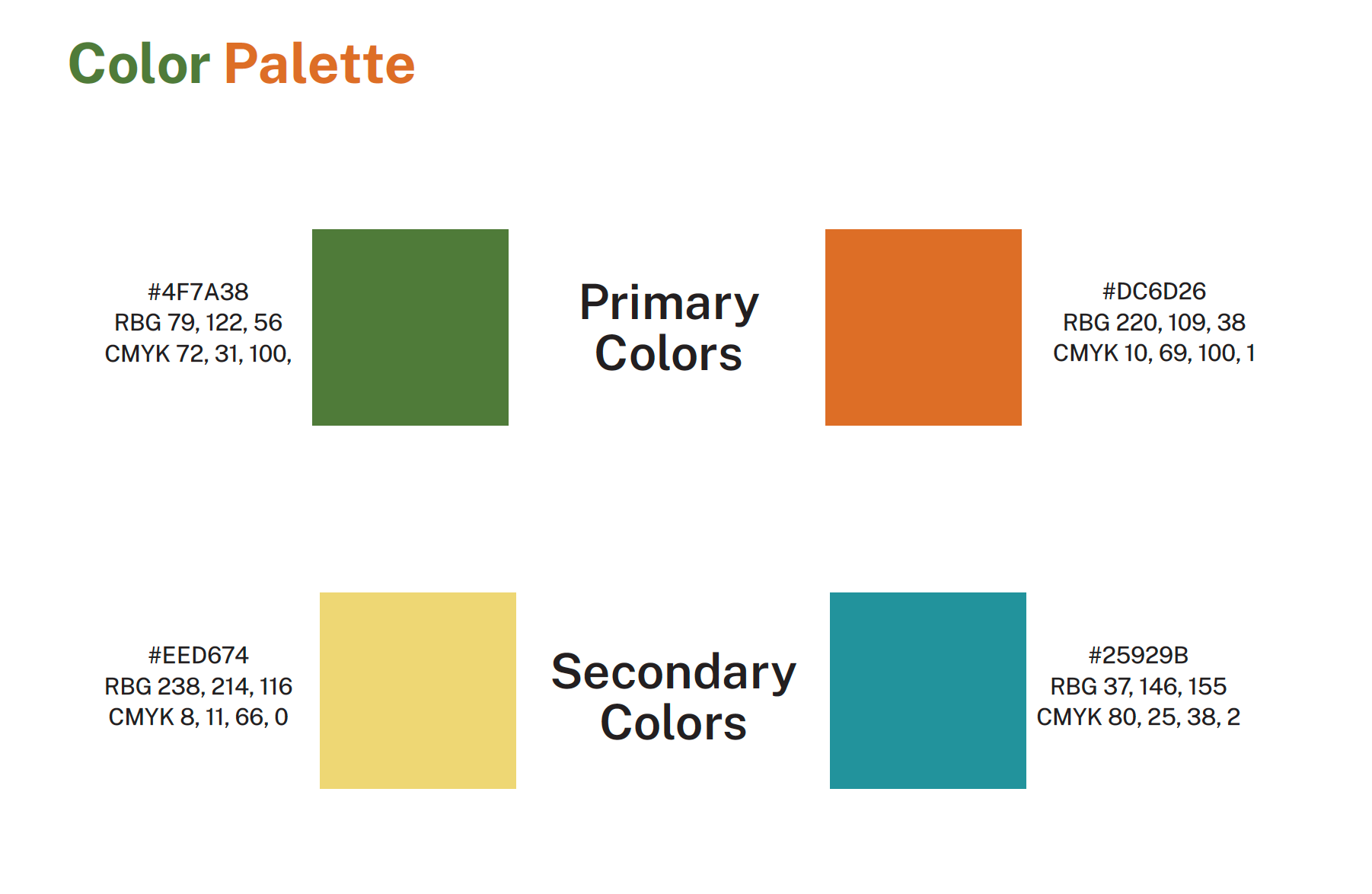
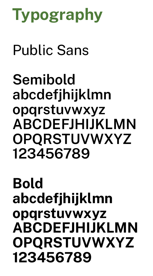
I developed brand guidelines for logo variations, color palette, and typography for universal usage. I created simple variations of the logo in different formats to ensure its versatility based on the client's needs. It can be used vertically or horizontally, in multicolor or solid color, or just with the icon. I chose the primary colors of green and orange to communicate the nature and positivity of Baltimore County Recreation and Parks. I also added secondary colors for other needs, like in an annual report. I utilized a sans serif typeface to modernize the logo and ensure readability.
Touchpoints
